

Shantae is series of action-adventure platforming games starring the half genie hero Shantae, the series debuted back in 2002 on the Gameboy Color and has been using a similar logo ever since, the logo in my opinion hasn’t aged well, it uses the Dael Calligraphy font which I’m not crazy about and the effects they apply to it don’t always help.
And so, I took it upon myself to redesign the logo for the Shantae series.


2002-2016
The logo uses Dael Calligraphy for its typeface, the typeface is intentionally imperfect to make more organic and emulate the look of handwritten words. The logo adds several effects a gradient, stroke, bevel, and highlights are applied also the logo being held in this ellipse.
2016-Present
They gave the original logo a bit of a refresh taking the away some of effects and for some reason they slightly squished the logo horizontally, but this causes the counters in the logo to become thinner to the point that counter in the E is almost illegible at a small scale.
Rebrand Proposal
My concept attempts to address the many issues present in the current logo whilst still feeling like a natural progression in the series. I wanted to keep that hand drawn calligraphy look in my rebrand, so I look to middle eastern scripts for inspiration and other adventure brands such as Indiana Jones.
When sketching out the logo I notice the S could kind of look like a ponytail which is appropriate given that the character of Shantae is iconic for her ponytail.
I always sketch my logos in black and white and later add colour to it in Illustrator, I kept the yellow to red gradient and added a stroke to the inside of the shape that's an inverse of the main gradient to give the logo fake bevel and some highlight.
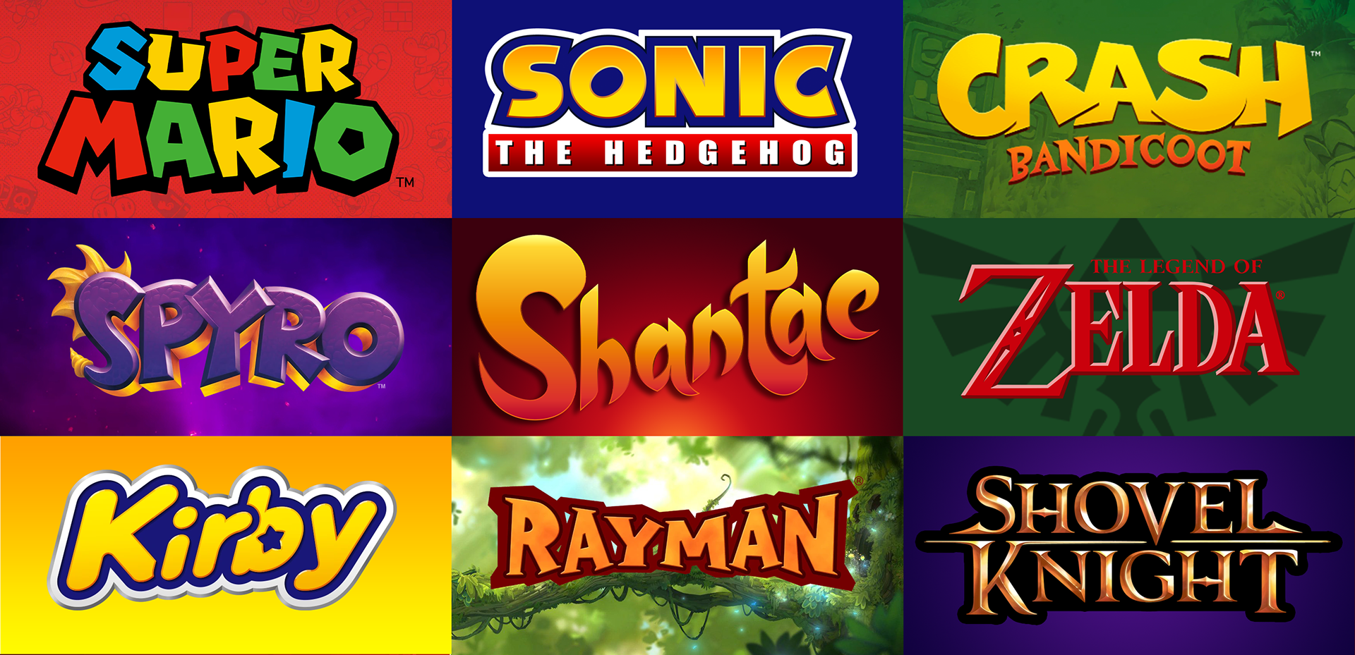
No logo exists in a vacuum, here we can see how my rebrand compares to the competition.
My rebrand stands out amongst the competition whilst bringing the Shantae series branding to the current standard for graphic design in today's gaming market.