
The way you brand yourself makes a statement on what you represent so here's what my branding says.
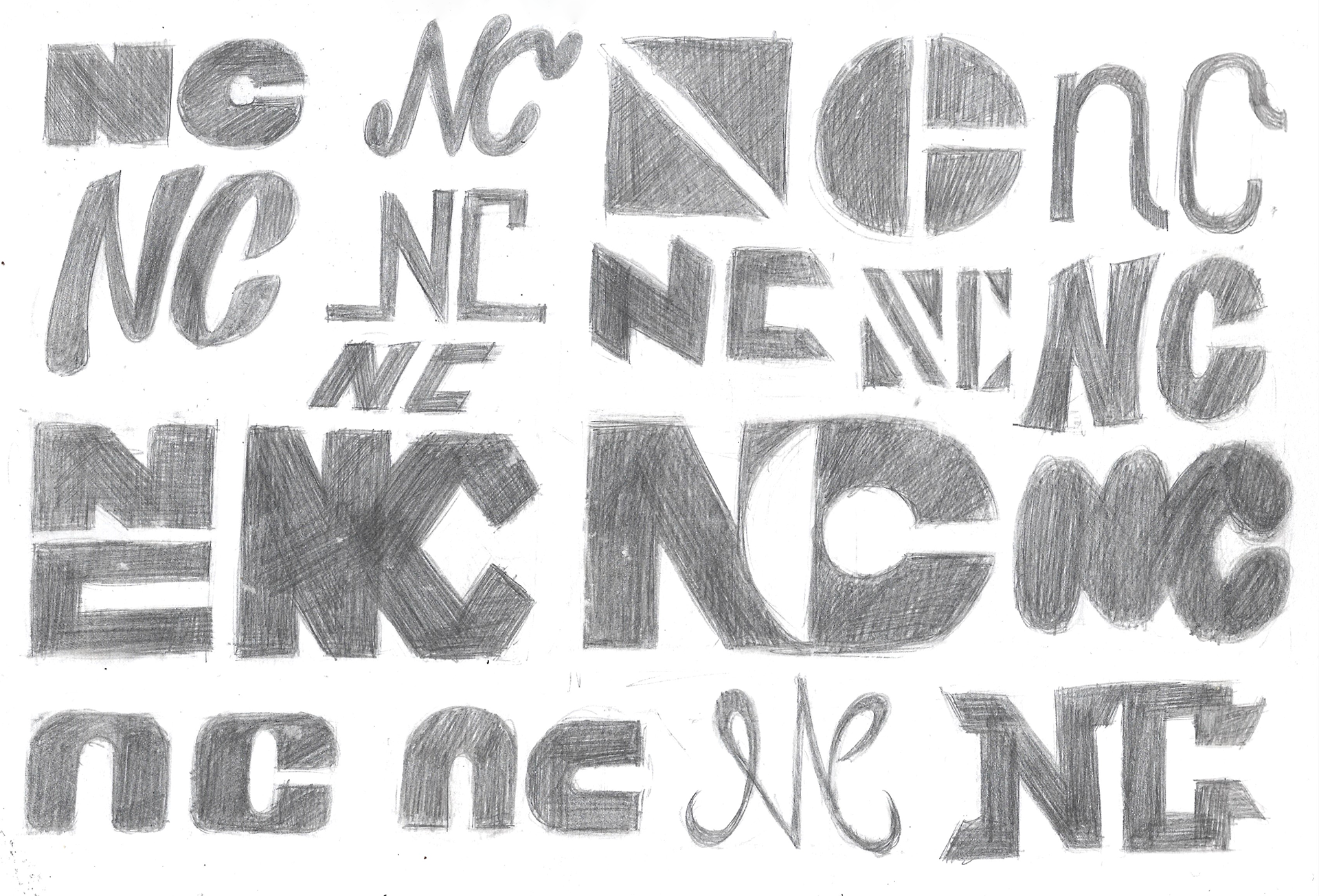
Logo Sketches
To start out I experimented with various monograms of my initials. I tried monograms that were blocky and hard and some that were soft and rounded.
I ended up settling with the one with that's both blocky and rounded for two reasons, for one I couldn't seem to get both letters looking appealing when limited to one style, so I settled for using both and my second reason is because I feel the contrast between the two shapes shows the versatility in my artistry.
I took this sketch into Illustrator and be finalised.
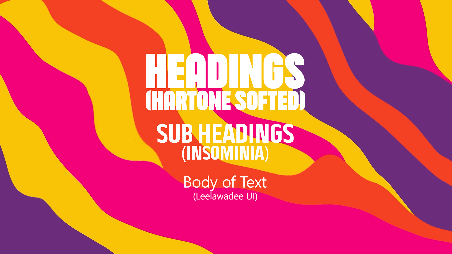
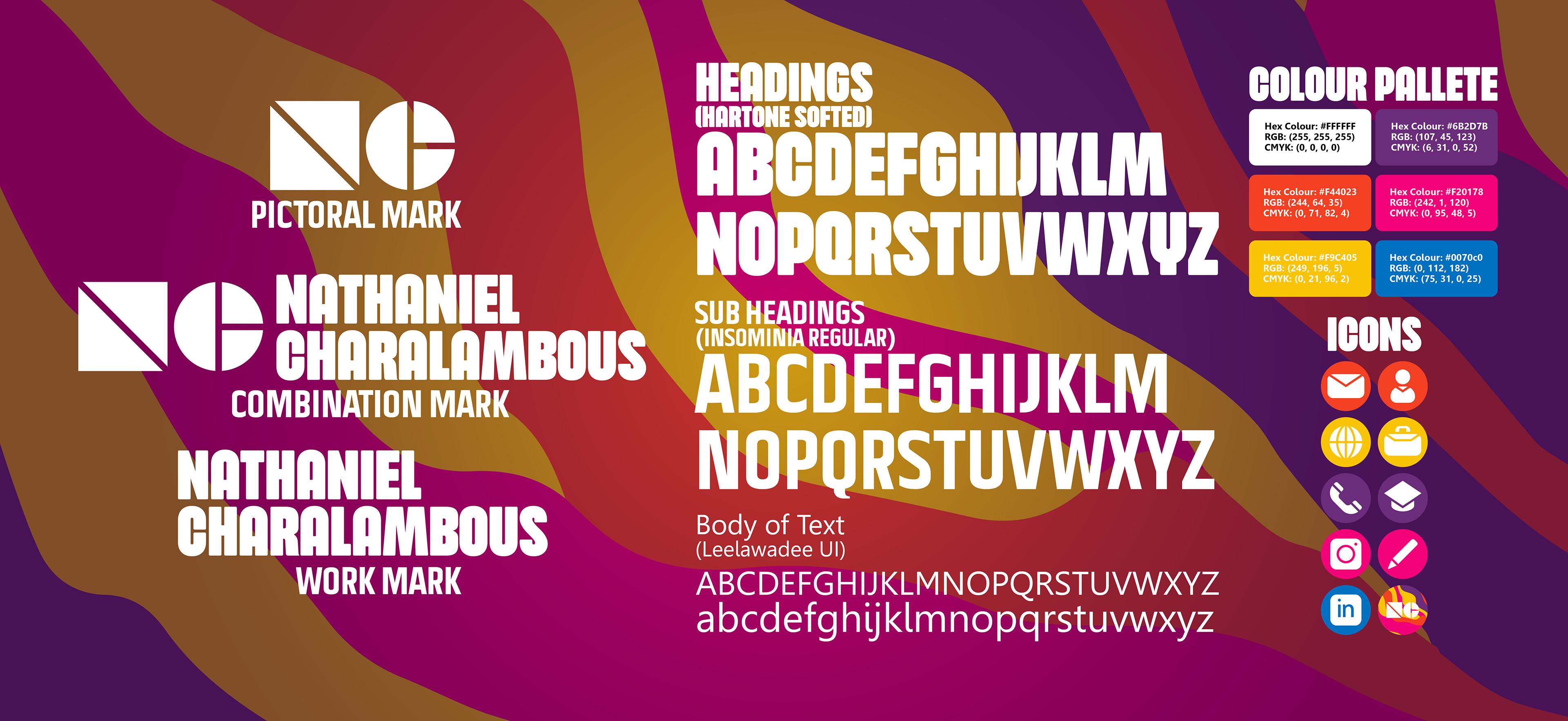
Typefaces
I chose Hartone Softed as my main typeface because my full name is long and so a wide typeface was out of the question and in general it complements my monogram well, with the lettering being blocky and rounded as well and the negative space being similar to the monogram.
Insomnia is used as for my subheadings because again it shares some characteristics with the Hartone typeface whilst being thinner.
The body text is Leelawadee UI, I chose this because I needed a simple, clean, and legible typeface for things like my CV.
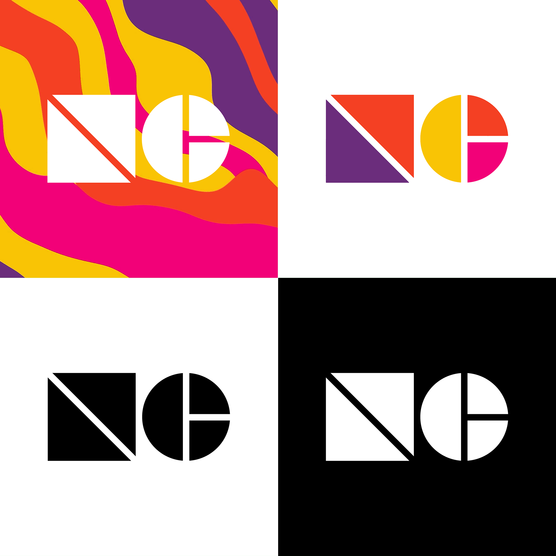
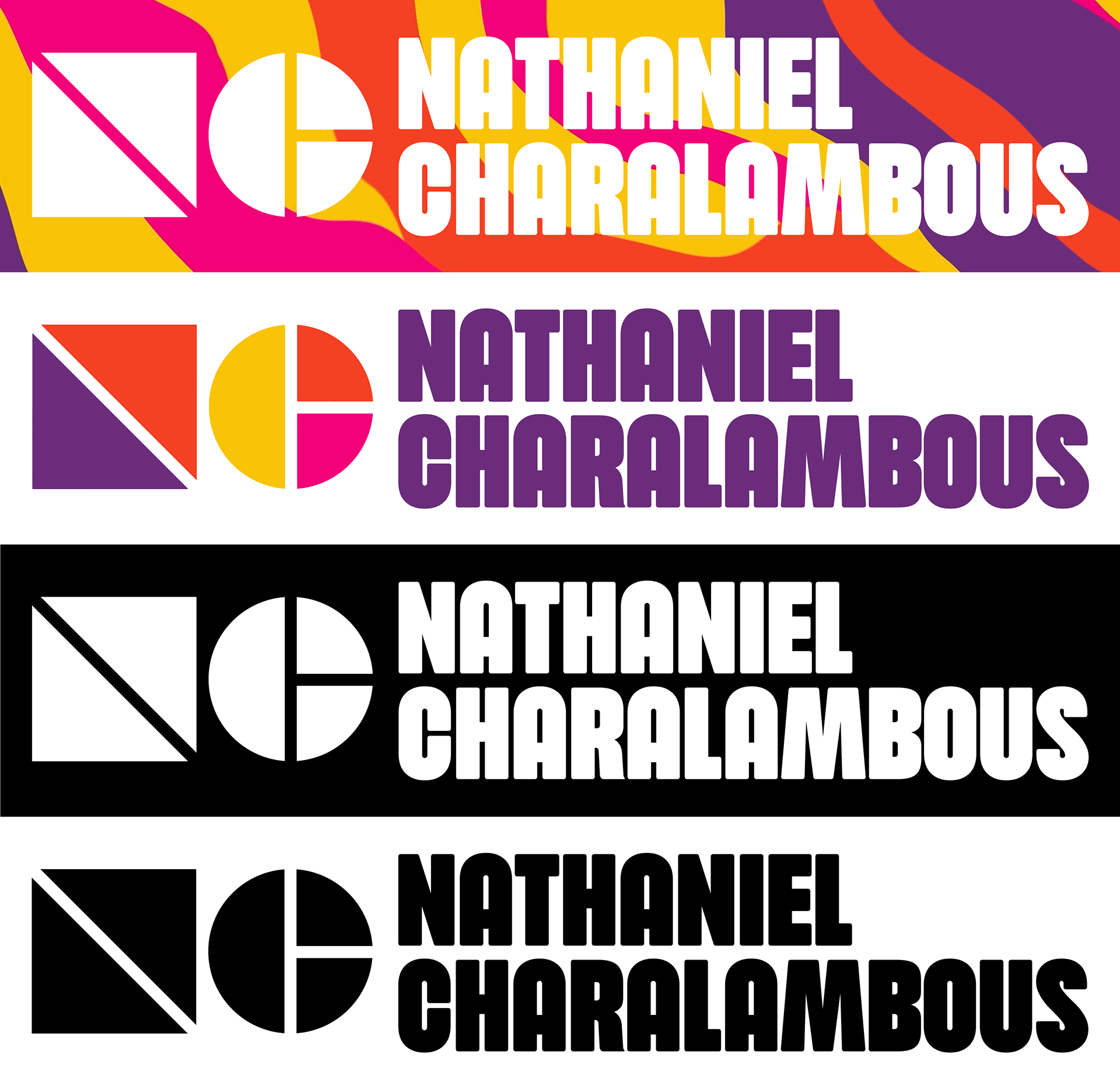
Logo Variants
The Logo must work in various places and so I tested how my branding would work on variety of backgrounds to see how the logo would look in those environments.
I experimented with colour and settled with red, yellow, purple, and pink as my brand colours, I believe settling for one colour as an artist greatly limits you and so chose these 4 as they're warm, friendly, inviting and most importantly creative.
It's here where I created the wavy pattern seen through all of my branding. This pattern was created in After Effects, using the pen tool I created several lines going down towards the left-hand corner, I turned on the wave effect and added turbulent displace on to each line.
I made the wavy pattern because I find things like lava lamps and smoke calming and wanted that in my branding.
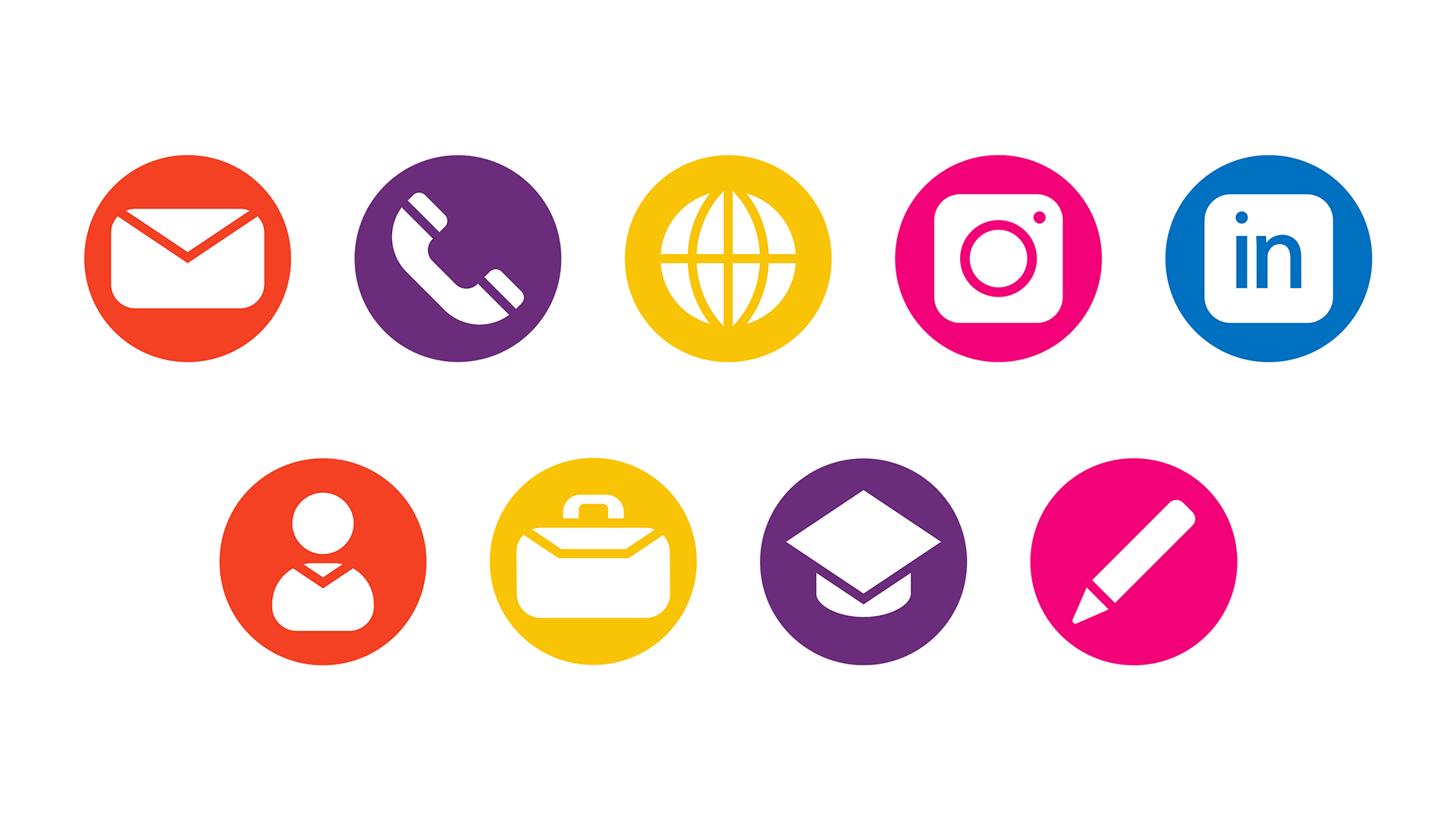
Icons
For my branding I created icons, I needed icons for my CV but couldn't find anything that matched my branding I had created, so I created several icons using Illustrator.
I didn't have a fifth colour to use to I made an exception given that it's LinkedIn and included blue into the palette.